Monday, October 22, 2018
Who Drew It Better? Tales vs. Baxter #6-10
By Siskoid and Russell
Continuing our comparison of the covers to the Baxter version of the Legion (volume 3) and their reprints approximately one year later in Tales of the Legion of Super-Heroes. The stories were exactly the same, but each issue had a brand new cover. So we go back to the age-old question: Who drew the better cover?
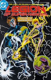
Russell: I have to start off by saying I'm not really a fan of either of these covers. The Baxter version plays up Lighting Lad too much, in my opinion. The Tales version, therefore, showcasing just Lighting Lass, is better designed. However, her facial expression looks likes she's as crazy as her brother Mekt.
Still, I give it to Tales this time for Lighting Lass being shown in her uniform and for the spotlight being solely on her. Also I like the colors more on the Tales cover, although that isn't necessarily the artist's decision.
Siskoid: I have to agree with Russell on this one. The original cover is just too busy. Mekt disappears into the background, Lightning Lad takes too much space, and Zymyr is kind of a parasite, clutter that distracts from the cover's main thrust. I wonder if, when Lightle does both covers, it's a chance to "get it right" the second time, or merely an opportunity to come at it from a different perspective. The Tales cover does both, though I've always found Ayla's face in that one less than Lightlesque (more Paris Cullins, maybe). There are still compositional parasites, but they're not in the art. Too many blurbs cover the image instead (though I do enjoy the "lightweight" pun). Tales takes it, but it's such a simple approach, it probably wouldn't have if the Baxter cover hadn't dropped the ball.
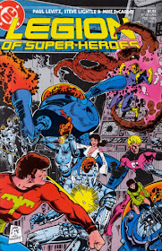
Russell: This is the situation I would much rather be in: I'm a fan of BOTH of these covers, and I'm not sure which I think is "better." Ironically, they are both by Steve Lightle, so he is competing against himself again.
I think I will give it to Baxter this time, though. I'm a sucker for "action" covers and LSH #7 is just very clear as to what is going on: Five Legionnaires are fighting robots. The Tales version is more symbolic: The five Legionnaires are searching for their way home. It's a great illustration, but I think Chameleon Boy is a bit too large; the proportions cause the other Legionnaires to be too tiny, where on the Baxter cover they are all give equal share of the spotlight.
Siskoid: I'm drawn to the abstract nature of the Tales cover, with Chameleon Boy reaching for Earth, but the planet eluding him. Lightle doesn't forget the planetary shield that surrounds Earth in this era, though it makes it look like a soap bubble, which adds to the abstract mise en scène.
But like Russell, I do like the original cover too, and certainly I like action scenes more than I do static team pin-ups, and the like. Hm. Well, on the basis that scale isn't that obvious to me on the Baxter cover, which obscures some of the interaction (with Cham and P.G., for example, even Ultra Boy), I'm going to hand it to Lightle's second attempt.
Russell: No doubt in my mind this month, Legion #8 is one of my all-time favorite covers EVER, so it gets my vote easily. I love the way the book's logo is part of the machinery. I love how the Controller is "watching" the Legionnaires. I love how Shrinking Violet is flying up to confront him. In my mind, this cover is the "one moment later" from Legion #7's cover. I can't say how much I love this work.
Not to diminish the cover of Tales #333, though. I'm a sucker for "Heroes Rushing Out At You" poses, AND the coloring and design of the illustration are very good. This cover is good, but the Baxter cover is great.
Siskoid: I just went and said pin-ups weren't as strong as more active covers, so I sort of have to put my money where my mouth is, don't I? Still the Tales cover has striking contrasts (here again, Violet is the stand-out figure) and the cover copy is dramatic. But it just doesn't compare with the cleverness of the Baxter original (the "O" of Legion actually being a thing on the wall, the robot's brain leaking out, all the expressions...), so yeah. No contest though I think this is the best "duo" in post.
Russell: I like how Steve Lightle (competing against himself again) used the same basic concept of the reunion between Element Lad and Shvaughn for both covers, but played it out totally differently. On the Baxter cover, all the other characters are taking precedence "before" the lovers' reunion. On the Tales cover, on the other hand, the lovers are front and center and *the others* are in the background.
I think the Baxter illustration is more subtle (or the Tales cover is too busy) so I give it to Baxter this time.
Siskoid: On the contrary, to me, the Baxter cover is more busy, hiding the romance with what really is a team pin-up, and one where the characters aren't really interacting. It's a clumsy collage, and I can't tell who those big shadows are supposed to be. With the Tales cover, we get the "down time" moment front and center, indicating this is a rest period between two action-packed sequences (the Legion's been on an out-of-control freight train for the past 8 issues!), and yet suggesting more action with subdued "surprint" coloring. Your eye isn't distracted from the main image, but you can choose to check out each of the little screens at your leisure. It also works as a visual gag, because all the alarm bells are going off and Jan and Shvaughn aren't noticing because they're so into each other.
Russell: Here's another tough one for me, because I like bits of both of these covers without really having a clear-cut favorite. I always thought Steve Lightle's cover for LSH #10 was a bit too complex for its own good. I understand that Wildfire's left hand is the Khund's left eye, and Sun Boy is glowing around the Khund's mouth, but what is Invisible Kid doing? He seems to be just floating there. It doesn't seem well designed. And what is that cruiser doing there? I like the Election Day poster being shot up, but it's not clear who shot it. This Khund? Unlikely. I do like the coloring, and the idea seems good, but the execution seems less than 100%.
On the other hand, the Tales cover seems a bit dull. Instead of the Khund, we get only the three Legionnaires. We get a bit of action in the backgrounds, but not much. I like how Invisible Kid is somewhat "at" his background (in space above Earth) so I think it would have been better if each Legionnaire had a different "background" motif, instead of using cameo scenes of an unnamed SP officer and a Khund (and another illustration of Wildfire). Extra points for including Colossal Boy, too. I give it to Tales this month.
Siskoid: I have to as well. The Baxter just doesn't work. Seeing these in sequence, you can sort of tell Lightle was experimenting with collage, but in this case, the image just isn't clear. I never notice Sun Boy (my Girls will say that's a good thing), can't really tell that's a Khund, and Invisible Kid looks real sleepy. We have to be told those are presidential candidates (because who are they?), which just looks pasted on. The one redeeming feature is subtle: The vertical Interlac on the left hand side says "VOTE".
The Tales cover isn't the best thing ever either, but it's got a few things going for it. One is that we're not used to seeing Jerry Ordway doing the Legion, so there's novelty there. The other is that while there's again an element of collage, the background has been subdued (just like the previous issue's) so the main figures pop off the image. Everybody's looking to the right as if this were a diptych; it isn't though. Had it been one gatefold image, we might have been more convinced. As is, it still works better than Lightle's failed attempt at something unusual.
So that's our second installment of Who Drew It Better. What did YOU think? Do you agree with us, or do you think we're totally off? Let us know in the comments!


Maybe it's just me, but on Tales #331 and #334, if I wasn't told Lightle inked himself, I probably would have guessed Pat Broderick was involved in those covers somewhat. Something in the linework just says "Broderick" more than "Lightle". Is it just me?
ReplyDeleteI hope you will someday cover the remaining Tales covers
ReplyDeleteWe will. We keep this feature for when something else falls through ;)
ReplyDelete