

By Siskoid and Russell
Continuing our series comparing the covers of the Baxter version of The Legion of Super-Heroes (volume 3) and their reprints approximately one year later in Tales of the Legion of Super-Heroes. The stories inside were exactly the same, but each issue had a unique cover.
So we bring up the age-old question: Who drew the better cover?

Tales of the Legion of Super-Heroes #336
(by Ernie Colon)

Russell: I'm a big fan of poster "running towards the camera" posed covers, so the Baxter version this time out wins it for me, hands down. That being said, I am not a fan of Comet Queen OR of characters "watching over" or "melting" into the action of another character's story, so I don't think I would have picked the cover of Tales #336 no matter what had been on LSH (v3) #11.(by Ernie Colon)

Siskoid: I have to agree, though I do find the inversion interesting. On the first cover, Lightle drew the Legion founders and Bouncing Boy is relegated to a humorous banner. On the second, Colon keeps the vertical power dynamic, but the colored "main" action is Chuck with Comet Queen, while the founders are in a passive pose, abstracted from the action. Even so, the first one is the better cover. The way Lightning Lad blasts the title, the personality coming off of Bouncing Boy, the symmetry... Colon's cover is messy in comparison despite my liking that 1) he comes back to the founders after his Cosmic Boy and Legionnaires 3 mini-series, and 2) that part of the image has a pretty lyricism to it.
Legion of Super-Heroes (v3) #12
(by Steve Lightle & Larry Mahlstedt)
 vs.
vs.
(by Steve Lightle & Larry Mahlstedt)

Tales of the Legion of Super-Heroes #337
(by Steve Lightle)

Russell: This time out is a little bit more difficult, because I really want to like both of these covers. Steve Lightle did both of them, so he is in competition with himself. For LSH (v3) #12, I feel like the cover has no particular "center." My eyes wander over the whole cover, over all the action, but I don't really get an idea as to what exactly is happening. The Legion is fighting a bunch of bad guys, I guess? Also I think the Legionnaires' logos on the bottom is supposed to be a decoration, but to me it's a distraction. On Tales #337 the opposite is true, but the result is the same: we clearly see Wildfire fighting a creature of some kind, but we still don't get an idea as to what exactly is happening.(by Steve Lightle)

Because the Baxter cover gives us more Legionnaires actually doing things, I give it to that issue, begrudgingly.
Siskoid: I don't have the same problem with the Baxter cover. The hero of the piece is clearly Superboy, and all the background action is clear to me thanks to them contrasting with the black of outer space; even the Legion logo's transparency helps in this regard. But then Superboy isn't doing much. Brainiac 5 and his opponent looks very stiff. And those Legionnaire symbols below are just terrible in that screaming yellow. So while I don't mind the basic design, I don't like the execution. As for Tales, Wildfire and the alien he's fighting have a strange awkwardness and Dawnstar and Superboy are in stock poses. Only Sun Boy seems to really be reacting to the situation. I'm kind of more excited about the caption about the election results being in. A toss-up, but I'm going to give it to the second cover, begrudgingly.
Legion of Super-Heroes (v3) #13
(by Steve Lightle)
 vs.
vs.
(by Steve Lightle)

Tales of the Legion of Super-Heroes #338
(by Steve Lightle)

Russell: Here's another confrontation between Steve Lightle and Steve Lightle. I give it to...Steve Lightle! The basic design of both covers is the same, but the Baxter cover features a red-hot sun in lieu of a zombie Karate Kid on a moonlit night. Because every time I look at LSH (v3) #13 I see that guy in the center with an ice-pick for a hand (?), I give it to the Tales #338. Brownie points for including the "new Karate Kid" on it, too. I'm upset that neither found space to include Karate Kid's sensei slash foster father on them, though.(by Steve Lightle)

Siskoid: This one is weird for me because I feel like I grew up with both. I collected Legion off the news stand, so I invariably got Tales, and only experienced the Baxter version vicariously through the inside back cover of Who's Who, and always loved this Baxter cover especially. The cover of Tales' ghost of Karate Kid creates a lot of dead space compared to the original, with its larger, fiercer Timber Wolf. The first cover puts him in the middle of the action, which threatens to overwhelm him. On the second, he's floating above it, safe. The Baxter version is thus the superior model for me.
Legion of Super-Heroes (v3) #14
(by Steve Lightle & Larry Mahlstedt)
 vs.
vs.
(by Steve Lightle & Larry Mahlstedt)

Tales of the Legion of Super-Heroes #339
(by Steve Lightle)

Russell: In our third "Lightle vs Lightle" bout, I am inclined to give the victory to the original, LSH (v3) #14. The idea is the same on both covers, applicants for new membership are rushing towards the reader, but the Tales# 339 cover includes actual Legionnaires as well as several characters I don't remember from the story! Plus, Energy Boy gets a huge place on Tales #339, although we all know he didn't get a place on the team. He should have been a little less prominent, AND his place should have been taken by either Magnetic Kid or Polar Boy (or Dev-Em, who had a larger part in the actual story than Energy Boy).(by Steve Lightle)

Siskoid: The problem with your take, Russell, is "we all know". But we didn't, did we? I rather feel like the original Baxter cover gives the game away by making the ones who made it in rather TOO prominent. The second cover hides them better and might even create some red herrings. I really like how BUSY it is, and again I find myself liking best the one with the least negative space. Plus, the expressions. There's so much more joy on the second one.
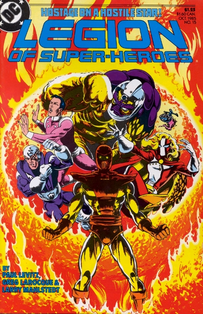
Legion of Super-Heroes (v3) #15
(by Steve Lightle)
 vs.
vs.
(by Steve Lightle)
Tales of the Legion of Super-Heroes #340
(by Steve Lightle)

Russell: I challenge anyone to choose Tales #340 over LSH (v3) #15. The Baxter cover has perfect coloring, perfect positioning of Dr. Regulus holding the Legionnaires captive, and perfect body language and/or expressions on the part of the hostages. Tales #340 pales in comparison. Not only does it have faulty coloring (purple and yellow?), an odd point of view of Dr. Regulus' head, and an odd expression on Sun Boy's kisser, the image doesn't even make sense. Sun Boy is chained to a ball of fire? Sorry, Steve, this one's a dud.(by Steve Lightle)

Siskoid: The ball is the sun, which is part of Regulus' plot in this story. So it's a metaphor. It's still not great because the villain is out of costume on that cover, and you only know it's him because of the cover blurb. Sun Boy's legs look weird too. I'm not in love with the original - Regulus melts into the flames because of his color scheme - but it's more expressive and features cool lighting and "special effects".
So we end our third installment of Who Drew It Better on FIRE. What did YOU think? Do you agree with us, or do you think we're burned out? Let us know in the comments!
(Siskoid does not condone the use of those puns.)
Steve Lightle wins, hands-down!
ReplyDelete